Why do you need a responsive website?
Have you recently checked out your website on a mobile, or a tablet, or another mobile device and found yourself scrolling and zooming in and out in order to be able to read its content?
So what exactly is a responsive design?
Wikipedia defines responsive design as
“…an approach to web design in which a site is crafted to provide an optimal viewing experience—easy reading and navigation with a minimum of resizing, panning, and scrolling—across a wide range of devices (from desktop computer monitors to mobile phones).”
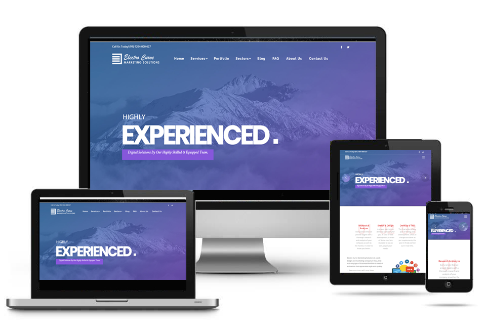
Responsive Web design has become an essential tool for anyone with a digital presence. With the growth of smartphones, tablets and other mobile computing devices, more people are using smaller-screens to view web pages.
These websites have to also consider the mobile-first index just announced by Google in April 2018. As more small businesses increase their mobile presence, their website, eCommerce, Google Business page, social media pages and other assets have to be easily accessible across all devices.
More people are using mobile devices. A recent Pew study 77 % of Americans now own smartphones in 2018 which is up from just 35% in Pew Research Center’s first smartphone ownership survey carried out in 2011, and these numbers are only here to increase.
Why Responsive Design is Important for Business
1. Increased Traffic From Mobile Users
Once upon a time businesses used to create two versions of one website. One for desktop users, and one strictly for mobile users.Many still do this today. But with ever increasing viewership from mobile users, having two separate versions of one website is a time consuming and high maintenance practice.
Nowadays, you can have just one responsive website that is ready for all devices. This ensures that people you retain your mobile viewers. And they might also remember to visit your website some other time whenever they are in search of services you offer.
2. Lower Cost And Website Maintenance
Another benefit of using a responsive website is: it offers you a lower maintenance cost as compared to running two versions of one website.However, it is relatively expensive in the beginning. But the reduced cost of maintaining two separate websites does add up.
Besides, it takes less time to setup. And it’s easier to maintain one responsive website than maintaining two versions of the same site.It frees up more time for you to dedicate to other important areas of your business. And you could also offer tailored location-based offers to drive traffic to your website.Need a place to start, you can access website design offers that are visually appealing and ready for all devices.
3. Provides a Seamless User Experience
This is by far one of the greatest benefits of having a responsive website. Unresponsive websites usually distort the way your website appears on devices like mobile, and tablet.Whereas desktop viewers might have no problem viewing your website, but the same cannot be said for mobile users.
Texts are jumbled, images do not align and users have to scroll through endless pages in search of the information they need. This makes it a pain for users to use your site smoothly and seamlessly.So after such an experience like this, do you think such a user would come back to your website? I didn’t think so too.
To avoid scenarios like this, it’d be worthwhile to evaluate the quality of your website design. The benefits that will accrue to you at the long run, will outweigh whatever you’re going to spend on it in the beginning.
4. Adapts Easily To Any Screen Size
Another benefit of having a great responsive website ready for all devices is its adaptability to any screen size.With a design like this, you’re way ahead of your competition. And it positions your website to seamlessly cater to newer devices with which users use to surf the internet e.g. smart watches, IOT devices, etc. Your website can automatically adjust itself to suit each screen. And finally …
5. A Responsive Website Improves Your SEO Efforts
Responsive websites have a greater likelihood of ranking high in SERPs.The ‘user focused’ experience, and high-quality content could increase your dwell time. Thereby making users stick around for the long run.
Google recommends a responsive website design pattern. Besides, it makes for a good user experience and improves your SEO efforts across all platforms. In conclusion, having a responsive website can save you lots of money, maintenance time and also help you to convert and retain more clients in the long run.
Get In Touch for a FREE CONSULTATION – Click Here